
Colour is everywhere. In every room, whether restaurant, clinic, office or shop colour is the dominant element. An element that is perceived more or less consciously - but can be used in a very targeted way. As head of the German Colour Centre, Architect and Designer Prof. Dr. Axel Buether has clear advice on this. .
As a colour expert, what do you recommend when it comes to designing rooms?
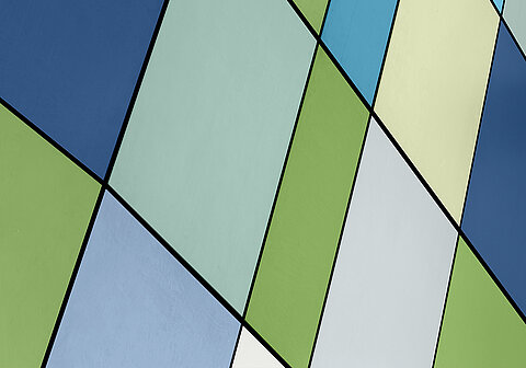
Use colour more consciously! It is a simple means of emphasising the function of a room. It helps to set accents and change proportions. Incidentally, dark colours have a bad image, and wrongly so. Dark shades set visual boundaries in the room and at the same time provide footing. White, on the other hand, removes boundaries from the room, perspectives are dispersed, one feels lost.
You have researched the effect of colour in a room in several studies. What are your most important findings?
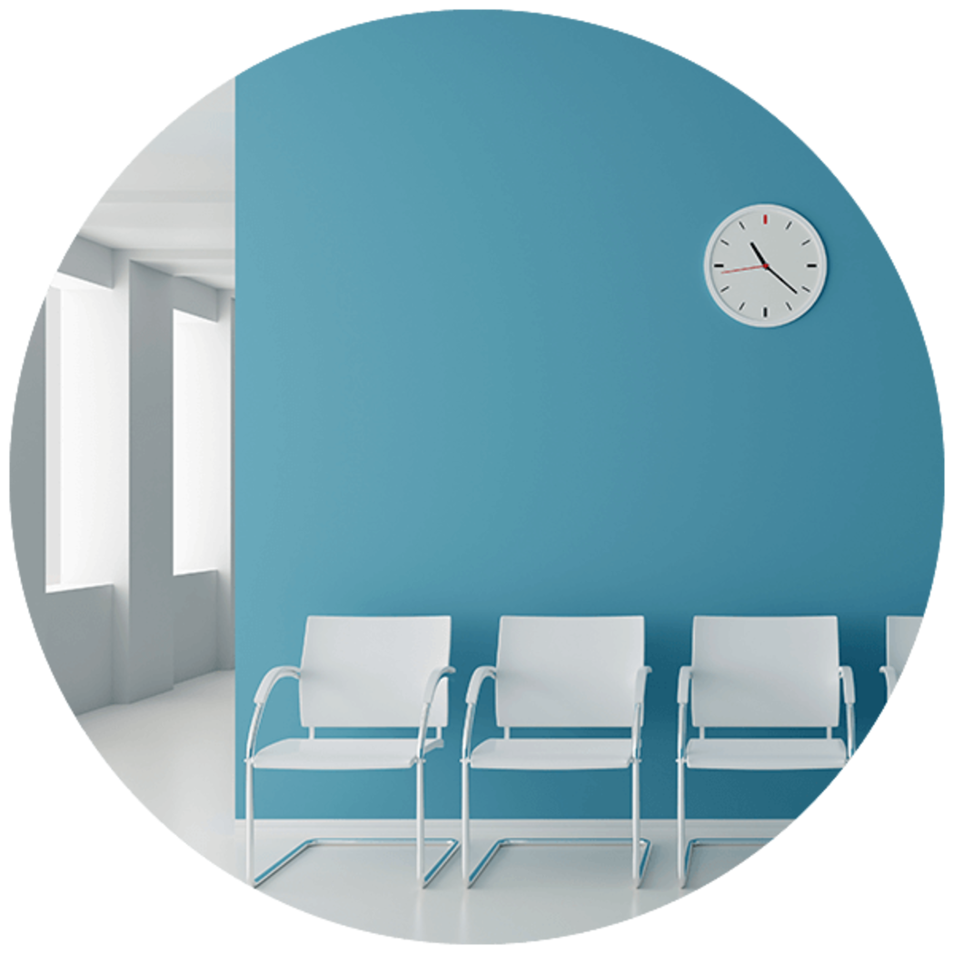
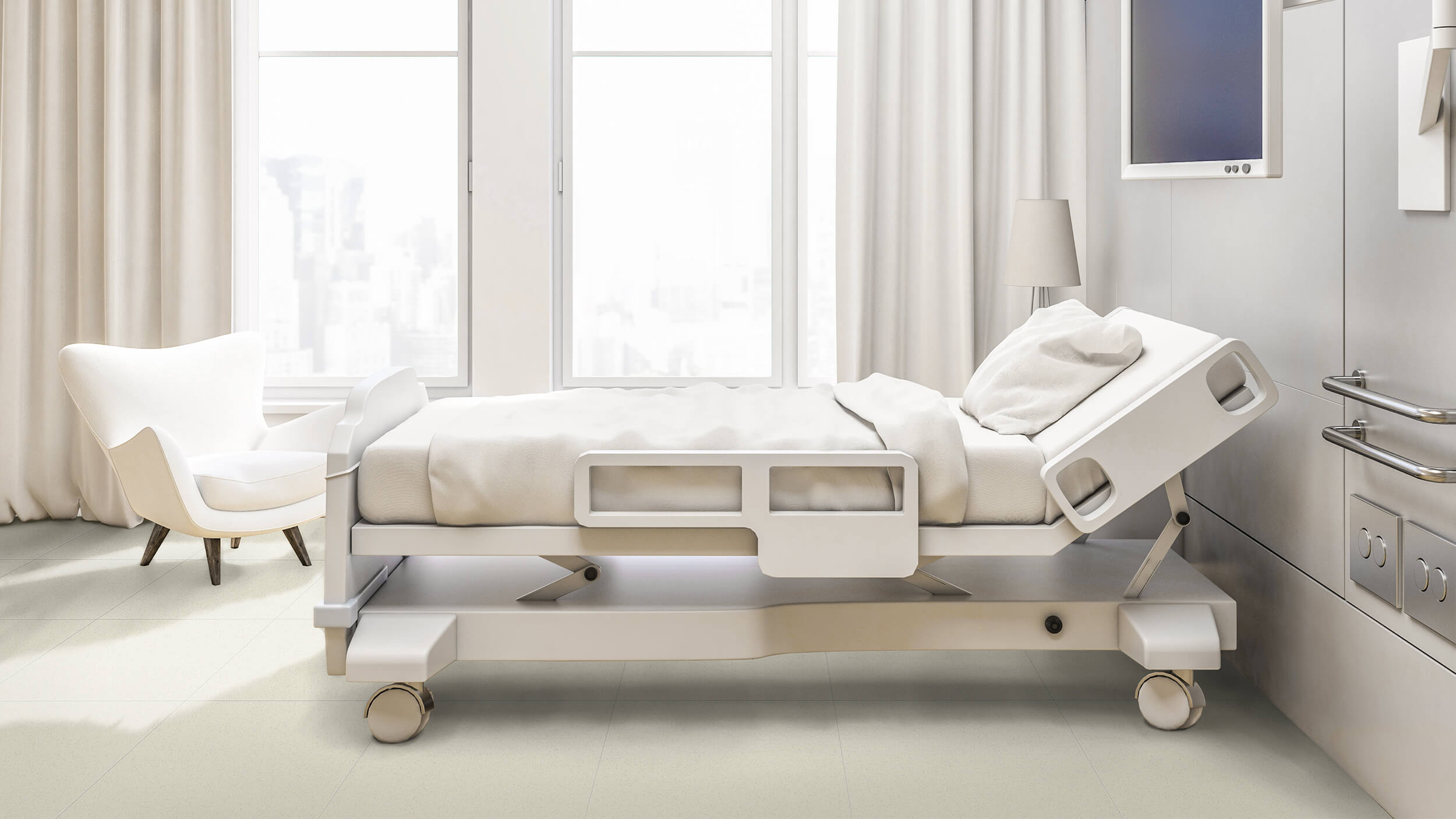
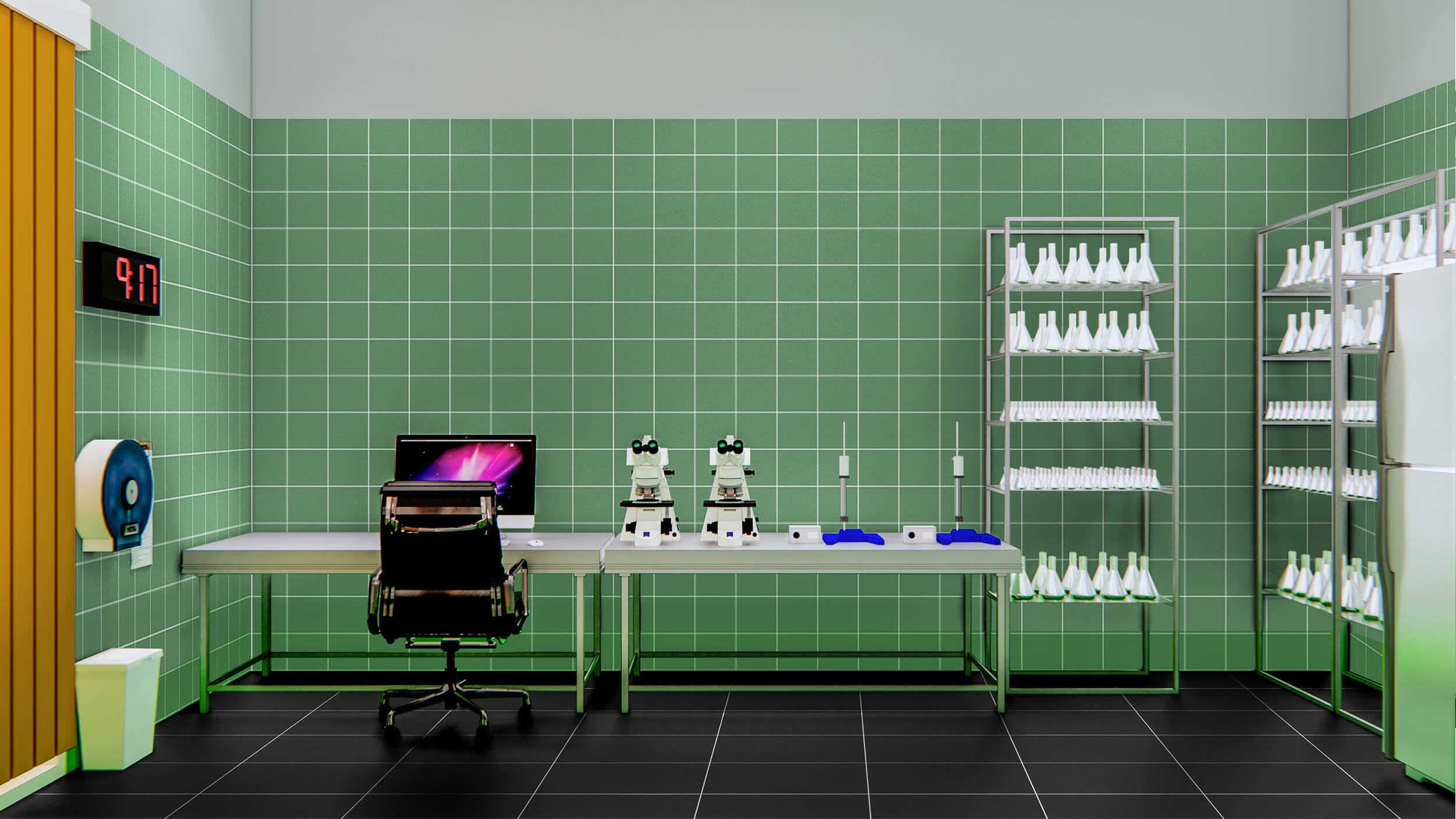
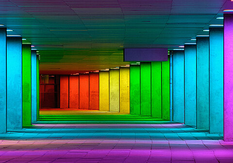
We already knew that colour can influence people's feelings positively or negatively. During the study of a hospital, we found out that the well-being of people can be increased to a great extent through the choice of colour in a room. Patients reacted very positively to the comfortable and vital atmosphere in patient rooms. When clinical white is substituted for colour, fear is reduced and trust grows. However, it was astonishing to find that the harmoniously coloured design of laboratories and offices significantly reduced the sickness rate among hospital staff. There is no better proof of the influcence a conscious use of colour can have.
You designed the Pro Architectura 3.0 tile system. Is ceramic for you more than just a medium of your colour system?
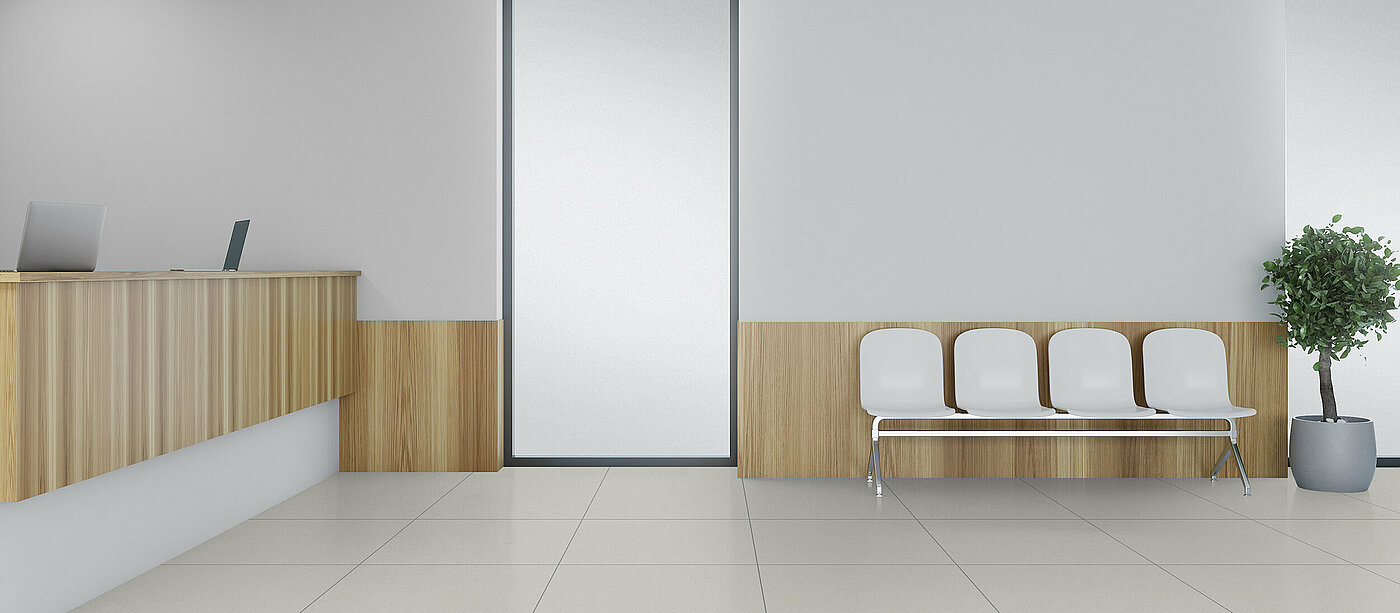
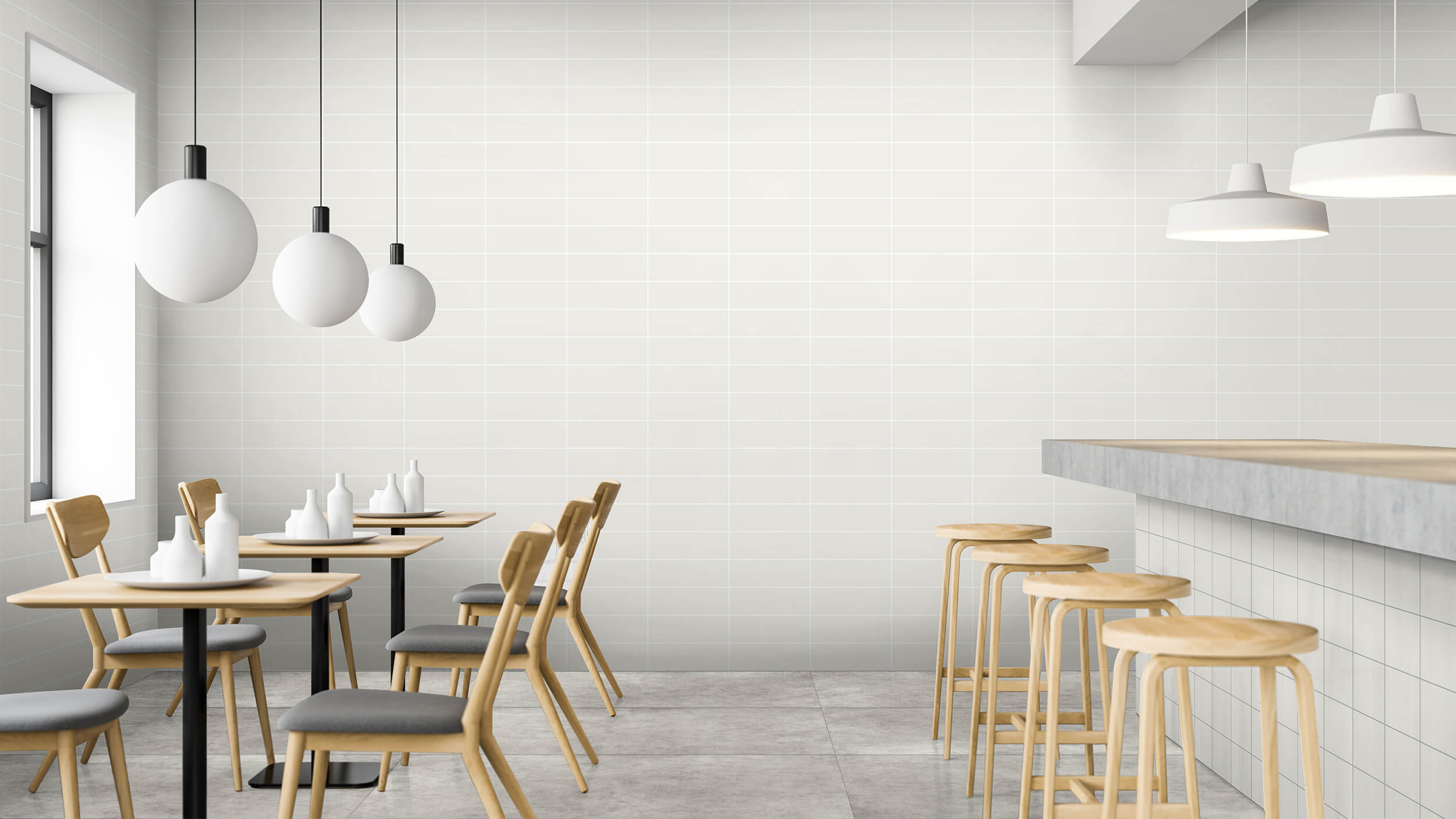
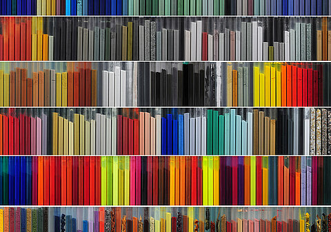
It certainly is. The ceramic material with its hardened surface naturally has practical advantages, especially when used in public spaces. If you only look at these aspects, you don't do justice to tiles as a material. With their own aesthetics, tiles are excellently suited to meet not only functional demands in a room but much more than that.. As a colour system in a mix of different formats and different materials, they can set accents - regardless of whether you want to create contrasts or harmonies. There are hardly any limits to creativity in terms of a multisensory experience. Increasingly, therefore, tiles are found where stylish, unusual room solutions are called for - in the design of sophisticated room situations in gastronomy or hotels.
One last question: Do you have any advice for designers?
Be more courageous in using colour!
Profile
Prof. Dr. Axel Buether: Architect, Designer and Perceptual Psychologist
Idea: People in the centre of interior design
Realisation: Development of the Pro Architectura 3.0 tile system
Inspiration: The multisensory experience of colour
Task: Professorship of Methodology in Visual Communication, University of Wuppertal, Head of the Deutschen Farbezentrum e.V., Wuppertal


