
Mit der Entwicklung der Pro Architectura 3.0 für Villeroy & Boch haben Sie alle Erkenntnisse zum bewussten Einsatz von Farben in einer Serie zusammengeführt. Wie sind Sie dabei vorgegangen?
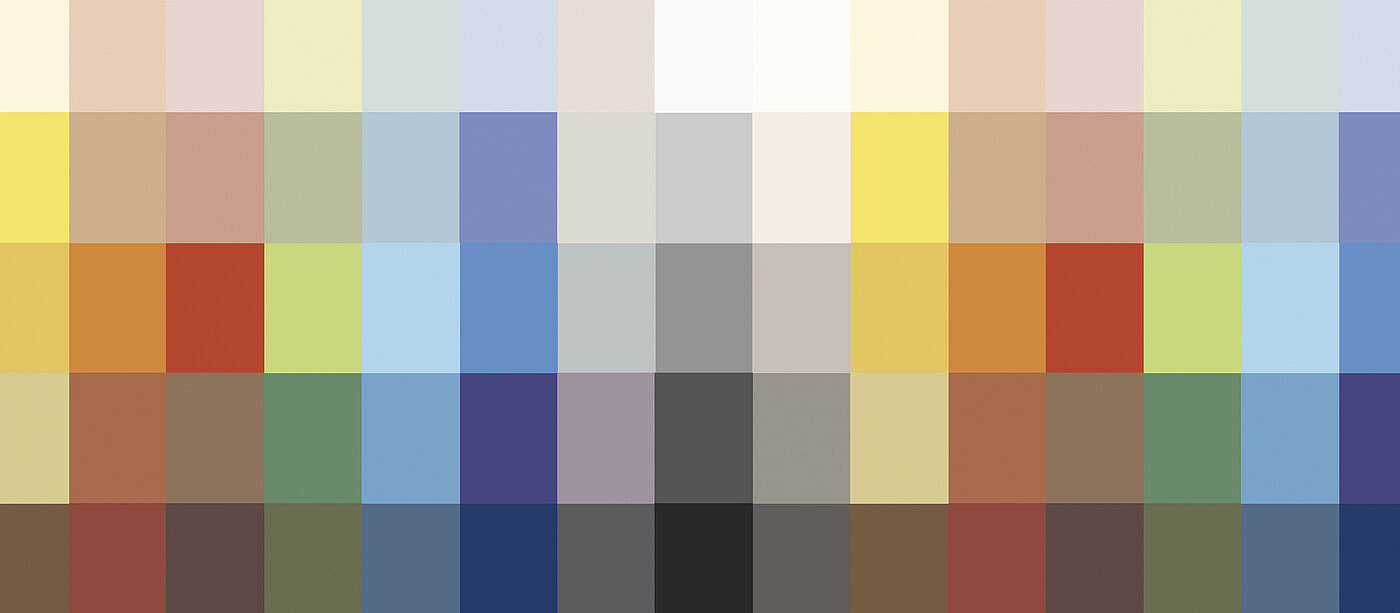
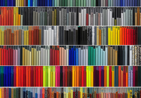
Die Entwicklungsschritte der Serie waren umfassender als man glaubt. Im Gegensatz zur Gestaltung eines singulären Fliesendekors spielen bei PA 3.0 viele Facetten eine Rolle. In Zusammenarbeit mit den Experten von Villeroy & Boch Fliesen haben wir zwölf Bereiche definiert, in denen Fliesen bereits eingesetzt werden. Ebenfalls haben wir die Farbtöne ermittelt, die gut in verschiedenen Anwendungsbereichen kombinierbar sind.
So ist auch der Name Pro Architectura 3.0 entstanden?
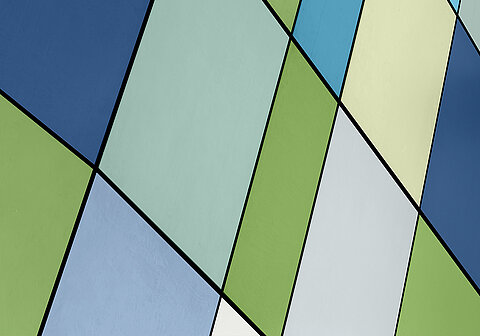
Die 3 im Namen steht für die drei Bereiche, die die Serie abdeckt: Ästhetik, Kombinierbarkeit, Anwendungsvariabilität. Mit Pro Architectura 3.0 ist es möglich, Farben so spannend zu kombinieren, dass daraus ganz unterschiedliche Raumerlebnisse entstehen können. Ein komplexes Farbsystem!
Combining colour in an exciting way and using it consciously: That means retrieving the information that our colour memory has stored. How is it done?
The associations that colours trigger should be familiar to every designer. Even the subtlest nuance of a colour literally puts it in a different light, so that completely different information is associated with it. Let me give you an example of how different colours work. The disruptive price sticker in shrill orange on a promotion flyer has the task of attracting everyone's attention. On the other hand, a design in subtle ultramarine blue conveys timeless value that is above trends.

"Colour is always associated with a certain message: A statement that is extremely important for designers and communication experts."
Prof. Dr. Axel Buether
The colour sets you have developed are considered a special source of inspiration.
The colour sets are of course not a must, but they give designers a good means of orientation to achieve a certain spatial experience with the successful combination of form, function and colour.
Combine color in an exciting way and use it consciously: That means retrieving the information that our color memory has stored. How does one go about this?
The associations that colors trigger are, of course, familiar to every designer. Even the subtlest nuance of a color literally puts it in a different light, so that completely different information is associated with it. The price disruptor in shrill orange on a campaign flyer has the task of attracting everyone's attention. The design in subtle ultramarine blue, on the other hand, conveys timeless value that transcends trends.
This proves once again that the material tile is not only functional, but also emotional.
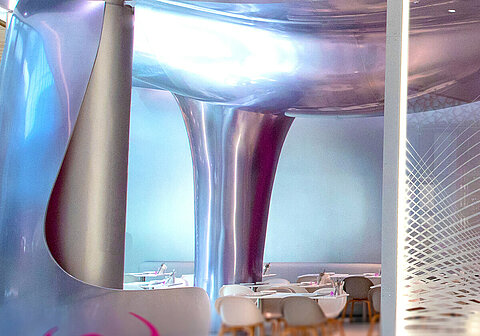
The Pro Architectura 3.0. has completely reinterpreted the tile. It creates endless possibilities in interior design and offers a whole new value for different applications and variety of usage. It goes without saying that Pro Architectura 3.0 achieves an ambience of sophisticated design - in the public sphere as well as in the private sphere.


