
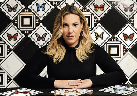
Profile
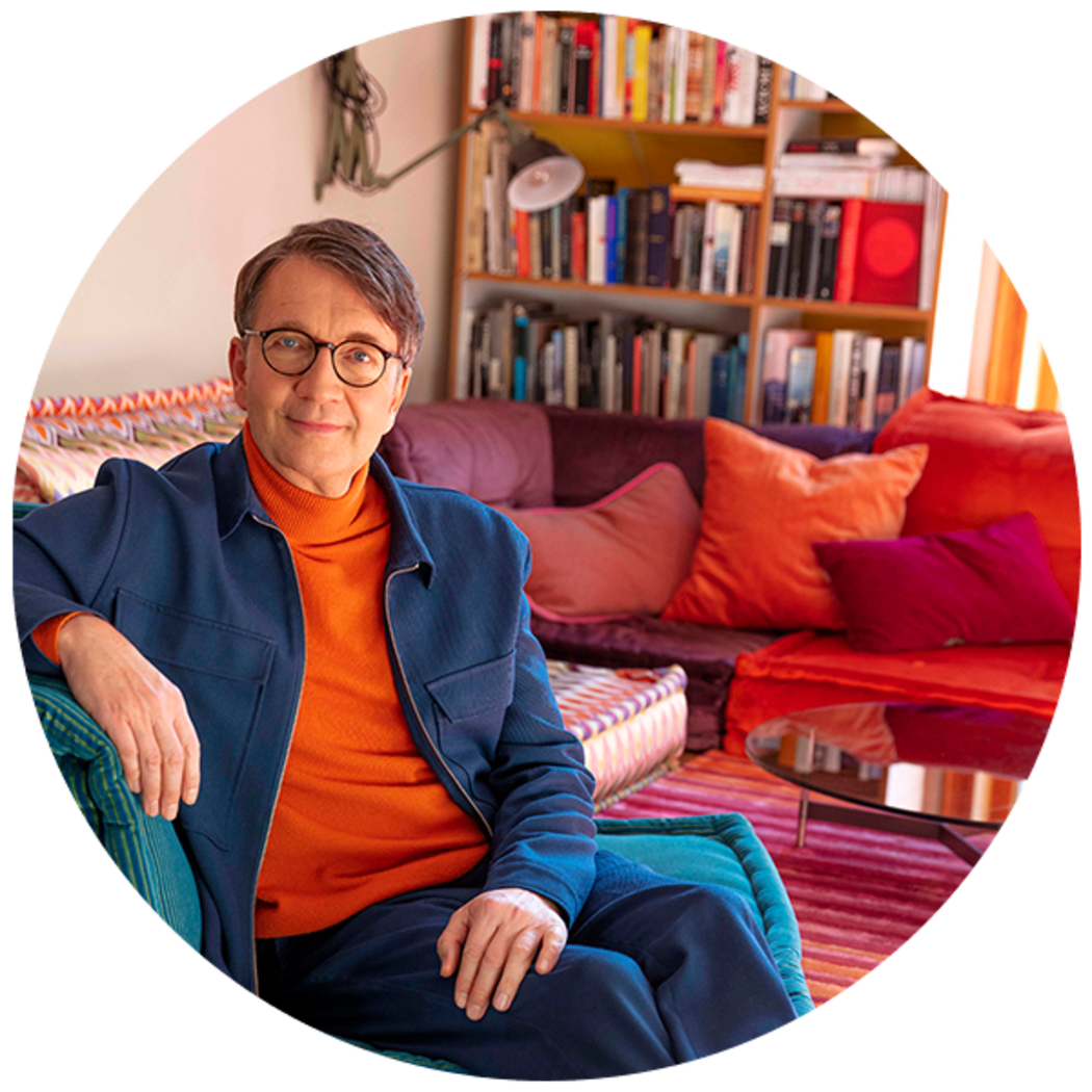
Prof. Dr. Axel Buether: Architect, Designer and Perceptual Psychologist
Idea: People in the centre of interior design
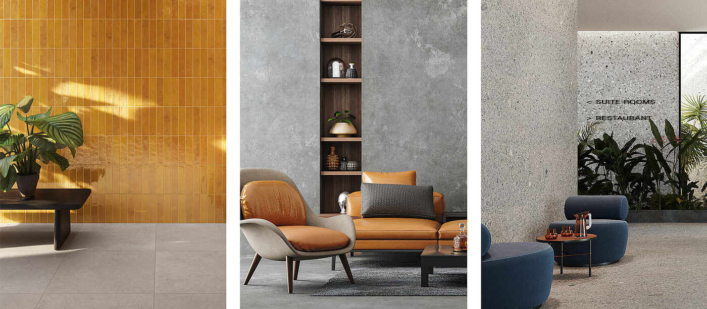
Realisation: Development of the Pro Architectura 3.0 tile system
Inspiration: The multisensory experience of colour
Task: Professorship of Methodology in Visual Communication, University of Wuppertal, Head of the Deutschen Farbezentrum e.V., Wuppertal

In his new book, “Die geheimnisvolle Macht der Farben” (~ “The mysterious power of colours”), Germany’s leading colour expert once again vividly illuminates how colours are used not only a a decorative element but also serve to influence our behaviour and perceptions in manifold ways. In this interview, Prof. Dr. Axel Buether describes how colours affect us on a psychological level – and how we can exploit an understanding of this topic for our own ends.
You talk about the “power of colours”. Does this mean that we have no way of influencing how our subconscious perceives and interprets colours?
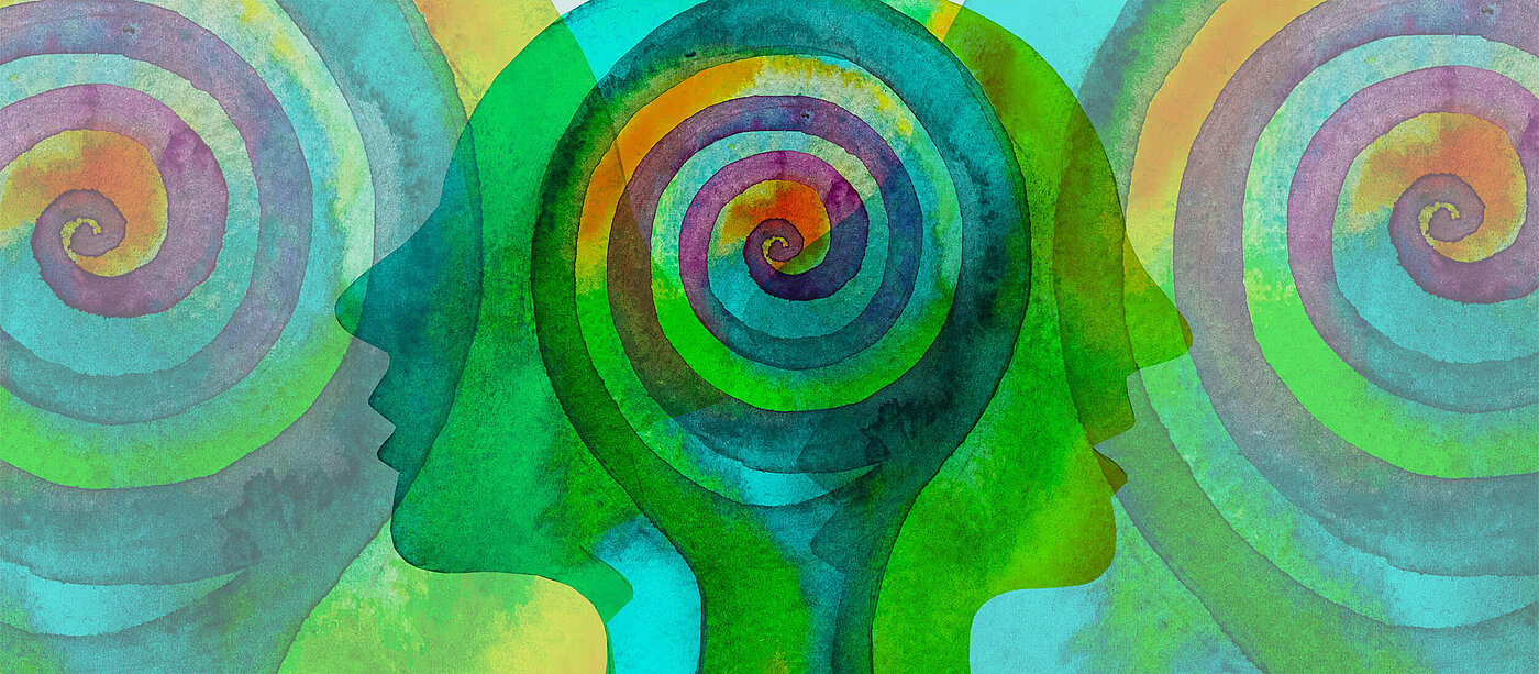
Nature has cleverly provided for a world full of colour. Colour is the first signal to be perceived by our brains. Our perception of colours gives rise to sentiments in a fraction of a second. Green is perceived as pleasant, for example – because we are informed by our evolutionary past and know that in woods and fields we will find a fruitful environment offering enough food. Colour also serves to communicate feelings in other people: When we affect the emotions of someone we are talking to, they may turn red – out of embarrassment or perhaps anger. In other words, colour plays a major role in controlling how we perceive the world around us.
Conversely, does this mean that we can consciously apply colour to engender certain emotions?
In many areas, such as the design of packaging, for example, colour has long been used specifically to manipulate our perceptions and actions. Food packaging sporting healthy green colours appeals to our instincts, as we associate green with natural ingredients and wholesome food. Similarly, we find a new fashion collection enticing because we are keen to own an article of clothing in a certain colour. By acquiring an awareness of this manipulation, we can evade the power of colours in this area, at least.


What determines a person’s colour preferences? Why do people feel good in one colour but not in another?
Objective criteria are skin colour, skin type and the colour of one’s hair and eyes, of course. There’s no general explanation as to why certain people feel good in certain colours. When it comes to clothing, the colours we choose often depend on the type of occasion. The feel-good factor is one consideration, but the role we wish to play is a further aspect. What impression do I wish to make on other people? Professional in a business setting, cheerful at a garden party, discreet at the theatre.
What many people overlook in this connection is that while a plain grey or black outfit may underscore one’s professional appearance, it also comes across as a uniform or mask. Personal traits are concealed and the wearer appears unapproachable. Colleagues attired in warm colours are at an advantage when it comes to establishing contact with others – the chemistry seems right and they will enter into conversation with those around them much more quickly than the plain grey individual. So dispensing with colour entirely in order to avoid making any mistakes is no solution. The art is to exploit the possibilities and abundance of colours for one’s own ends and to find the colour that best underscores one’s personality.


How do these insights translate into the world of interior architecture?
We’ve long been aware that colours play a major role here, too. As colours trigger certain key stimuli in us, it is important to find the right colour attuned to the use of the room concerned from the outset. Apart from enhancing our well-being, this also provides for rooms that will retain their appeal. The right choice of colour avoids dissatisfaction with our surroundings and a subsequent desire to renovate rooms..
A room all in white, for example, is predestined to make us feel uncomfortable. White does not evoke positive connotations in our subconscious minds. After all, in nature an entirely white environment is just about the most inhospitable and hostile setting imaginable. Snow, ice and extreme cold are the associations here.
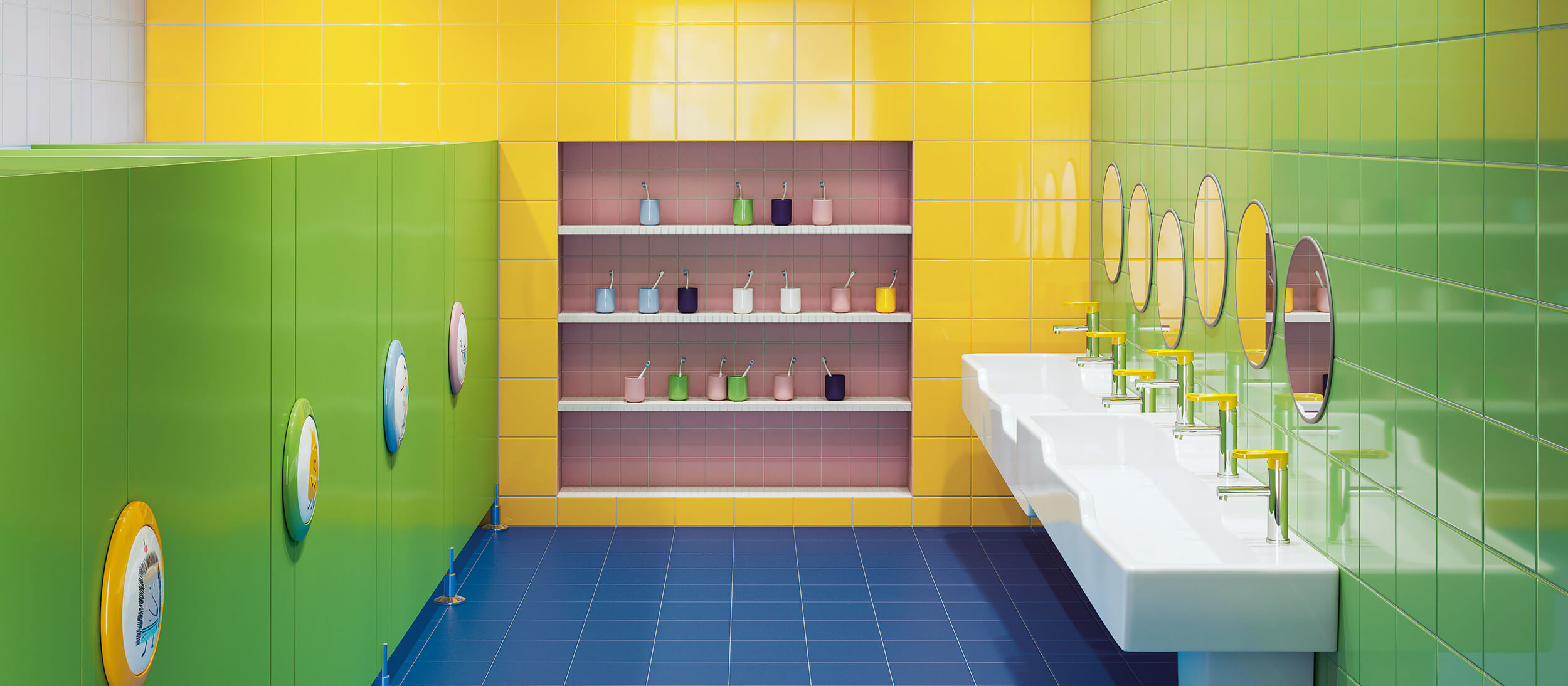
This doesn’t mean that simply choosing supposedly warmer colours is the answer to everything. Every individual has different needs, and rooms have a quite different standing today. The bathroom and kitchen have long become much more than merely functional rooms, for example. The bathroom is an environment in which people want to feel comfortable and relax, while the kitchen is a hub where family and friends come together. For these rooms to fulfil their functions properly, their colours need to be chosen with care. It’s not sufficient just to go for plenty of colour instead of white. It’s important to visualise what one is aiming for.
So is this where the colour experts come into play?
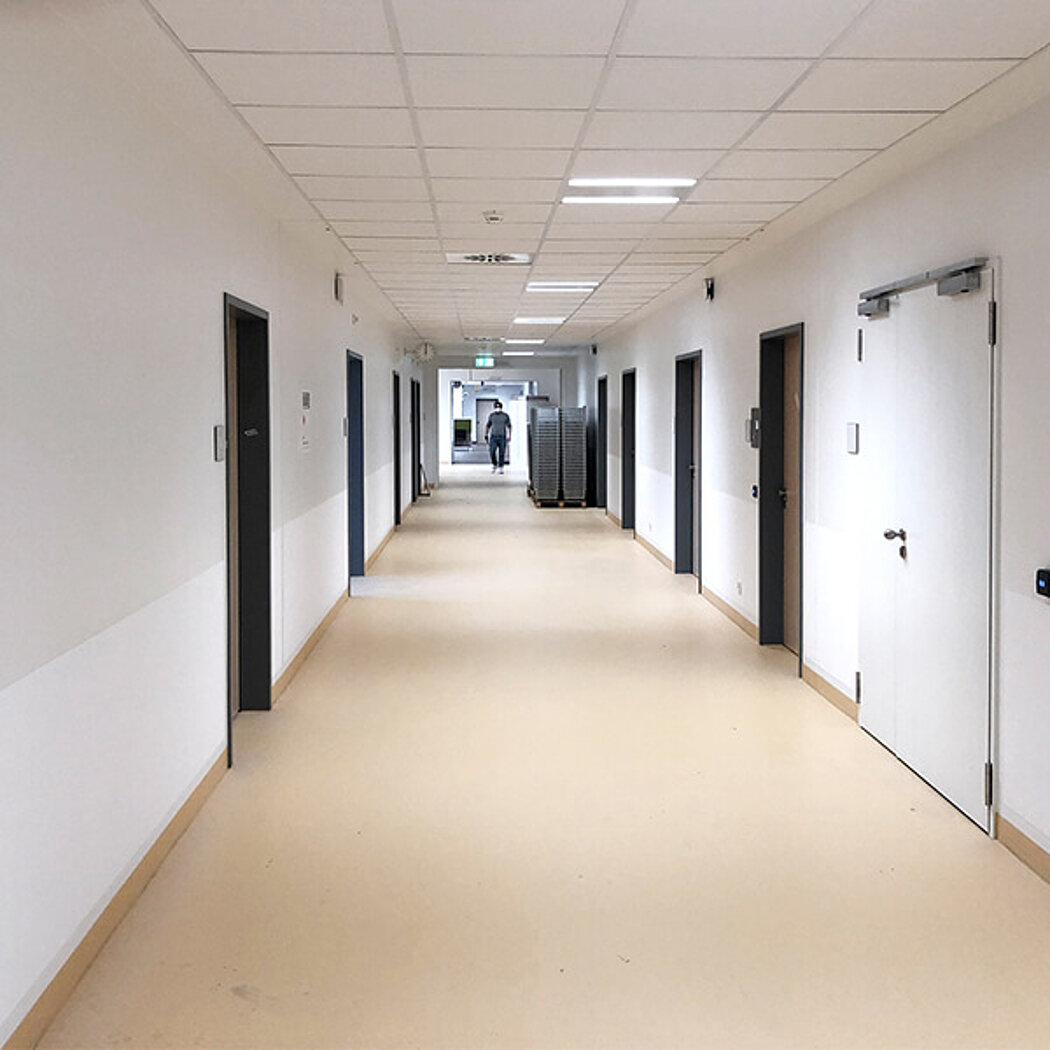
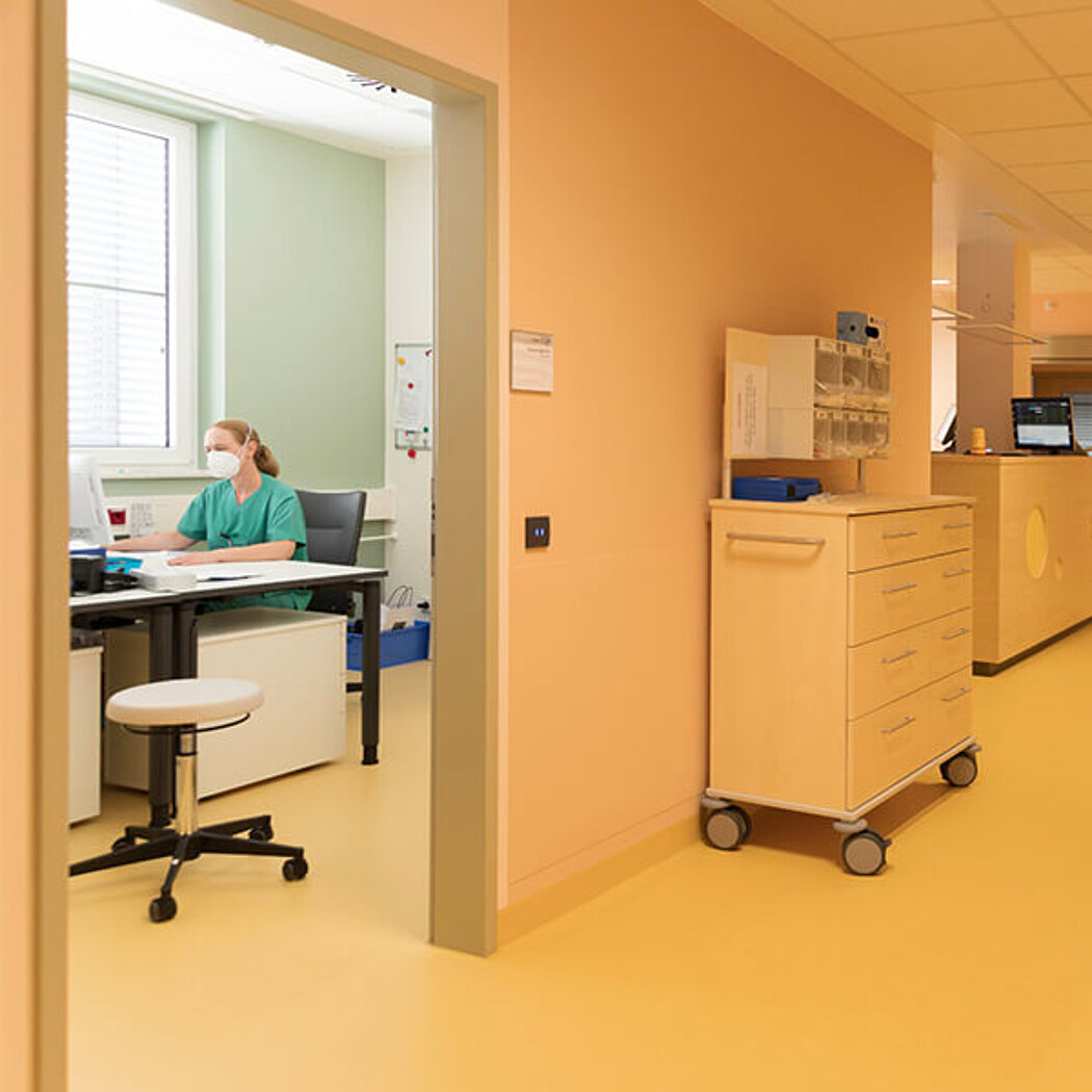
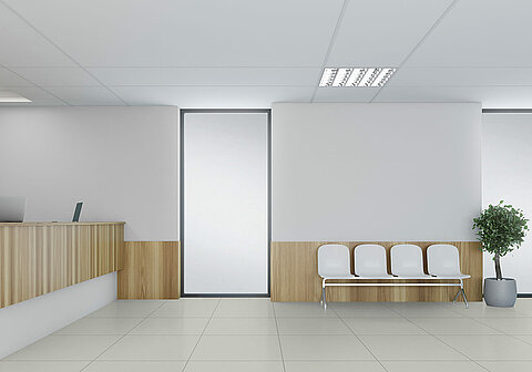
In theory, yes. In practice, I’m afraid that happens all too rarely. Colour is not exactly a prime topic at universities and in training architects and interior designers. There is a realisation that the choice of colours for many types of properties should not be based on the planner’s personal tastes, however. Particularly when it comes to designing hospitals, schools, office buildings or nursing facilities, decisions in this area are now commonly left to colour experts. We then examine the target group’s requirements in depth and consider how the interior environment can address these needs. Are we concerned with enhancing pupils’ attentiveness? Or helping colleagues to focus on their tasks while working together at a single workplace? Or ensuring that patients feel safe and sound? In the latter case in particular, it has also become apparent that patients are not all alike: Patients in a palliative care unit will feel comfortable in a different setting to patients suffering from dementia. Many discussions to clarify the exact given needs ultimately enable us to use colour as a means of creating the right atmosphere which is appropriate to the room and the purpose for which it is used. Colour to help people in the room do a really good job, to help students learn, to help patients recover. Colour schemes designed to have a calming or stimulating effect.
In one of our research projects we analysed the requirements at various hospitals, chose corresponding colours for their interior design and subsequently assessed the outcomes. We found that our choice of colours had often shortened patients’ healing and recovery times, reduced the extent of medication required and improved the success of therapy.
But attitudes have already changed in many areas, haven’t they?
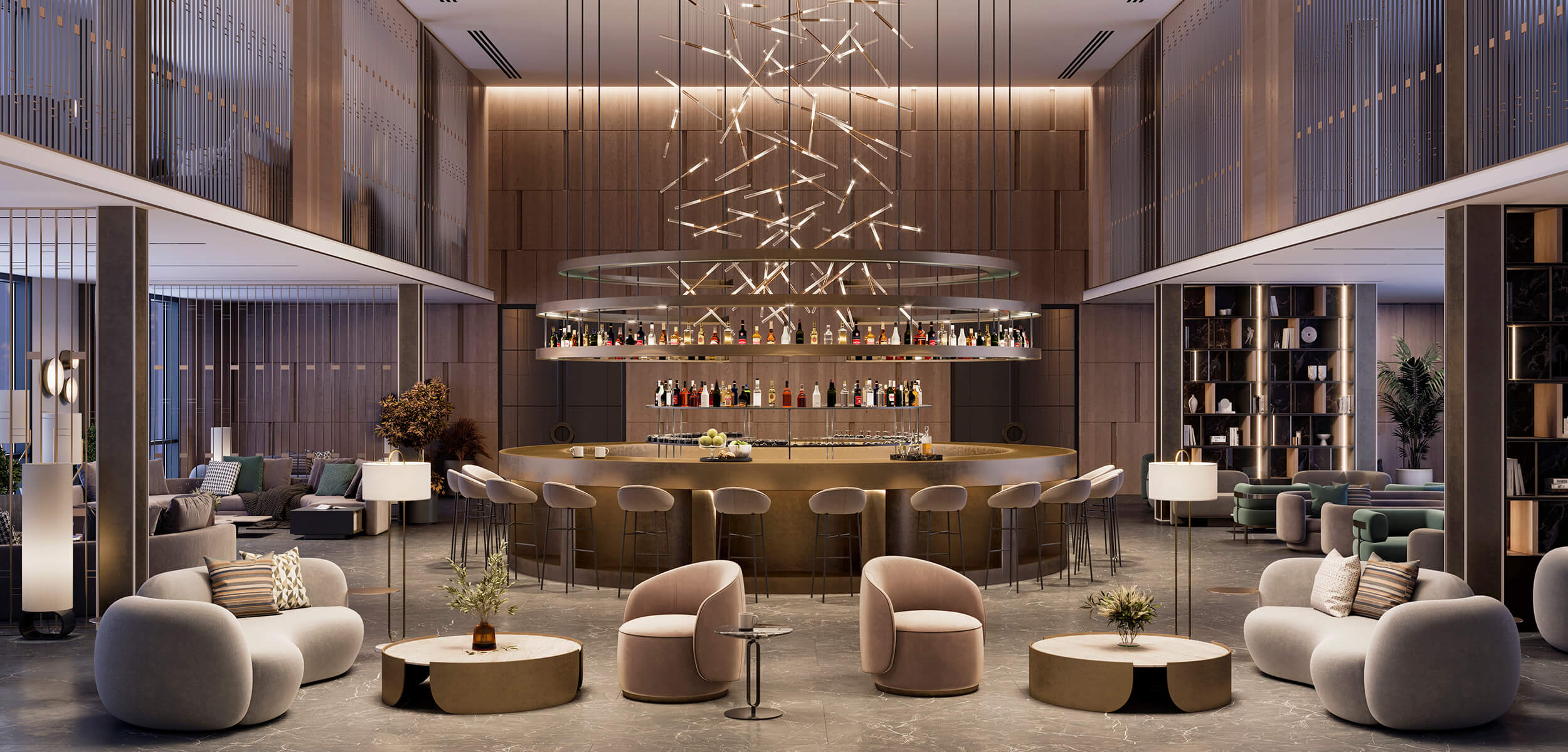
Yes - in hotels, for example. A hotel appointed all in white would fail to attract any guests today. Warm, feel-good colours now welcome visitors as soon as they enter the reception and lounge areas. The colour concept is continued throughout the corridors, restaurants and rooms, offering a feeling of security and reassurance throughout.
If planning and applying colour is such a meticulous matter, can’t that be a little disconcerting? Is it still allowed to choose a colour according to one’s own tastes?
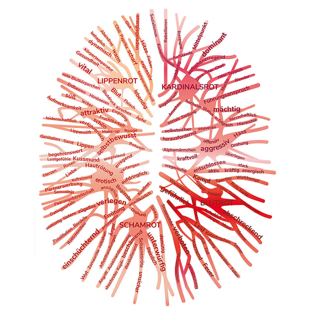
Of course - in the personal area that is a must. Here too, the subconscious helps us to do everything right by intuition. We conducted a survey in which we asked various people first of all to define an attractive and an ugly colour. Then we asked the respondents to name the colours that gave them a sense of well-being. The upshot was that earthy tones represent absolute feel-good colours for most people – precisely those colours that were initially rated as being ugly.
So people don’t need colourful surroundings?
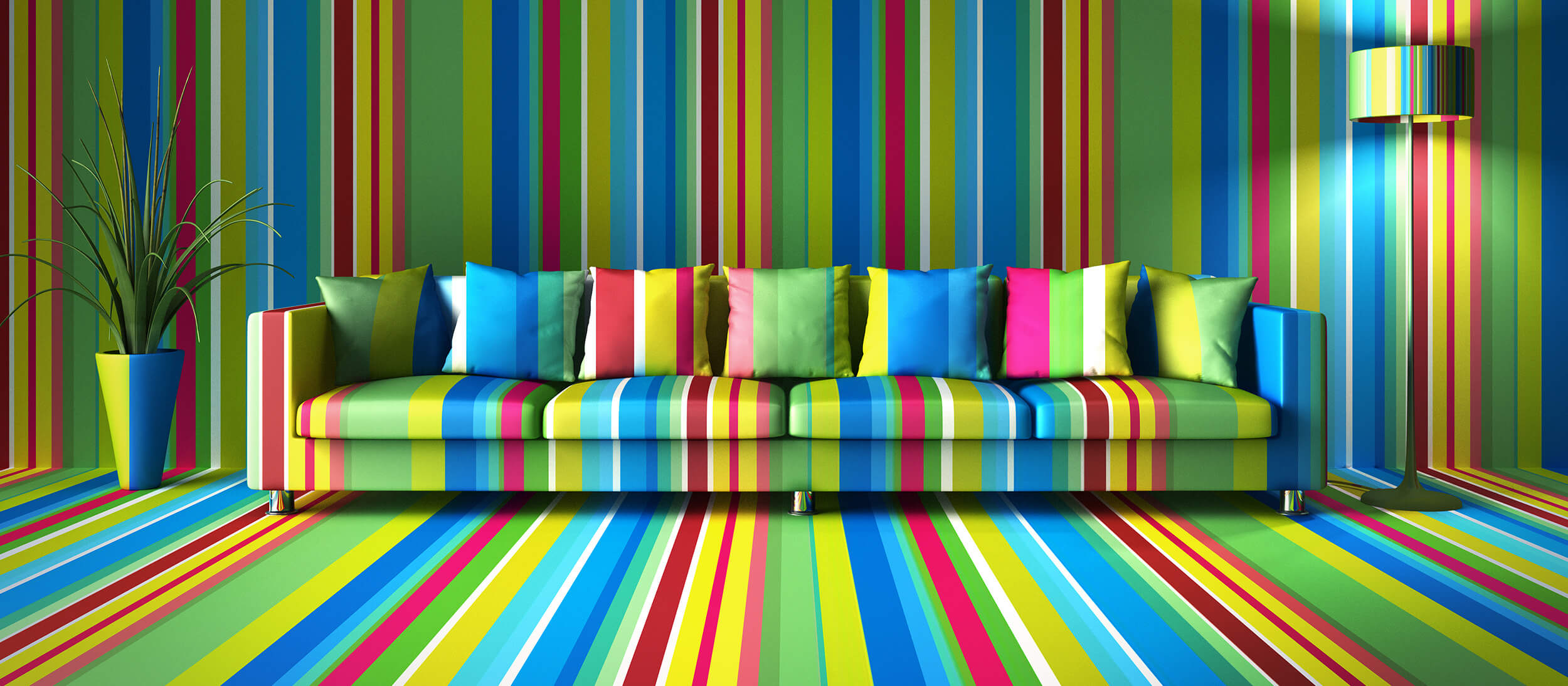
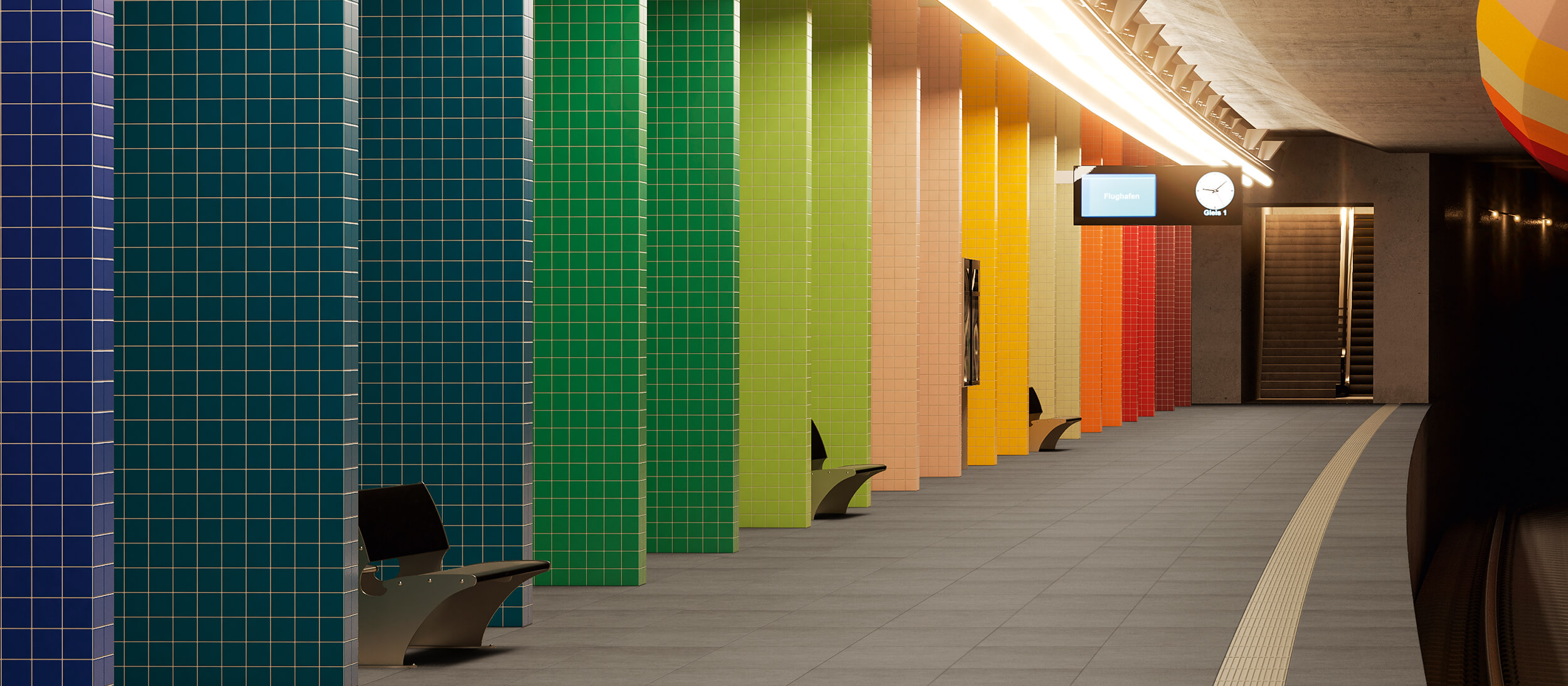
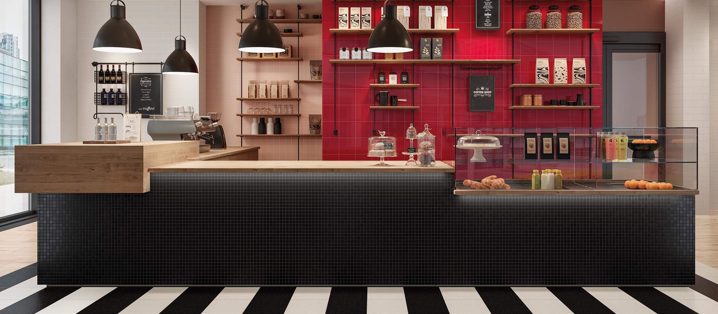
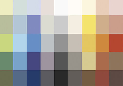
On the contrary – but it all boils down to finding the right balance. We paid close attention to this aspect in developing the PRO ARCHITECTURA 3.0 tile range. Rather than simply creating tiles in various high-quality, traditionally produced colours, we developed twelve colour sets within the colour system as a source of inspiration for planners and architects. This gives rise to a form of colour matrix offering scope for combining colours, materials and surfaces, so as to enable the design of environments that lend the individual room its own signature feeling which is conducive to well-being.
What special piece of advice would you give us to keep in mind?
Everyone is a colour expert – they’re just not aware of the fact. To find the colours that are good for you, you need to get to grips with the whole concept of colour. It’s not sufficient just to deck out a new room in your favourite colour. Rather, you need to consider what purpose the room is to fulfil. Only then can you make the right choice of colour.


