
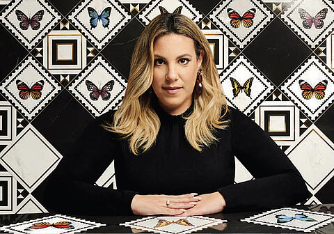
Profile
Prof. Dr. Axel Buether: Architect, Designer and Perceptual Psychologist
Idea: People in the centre of interior design
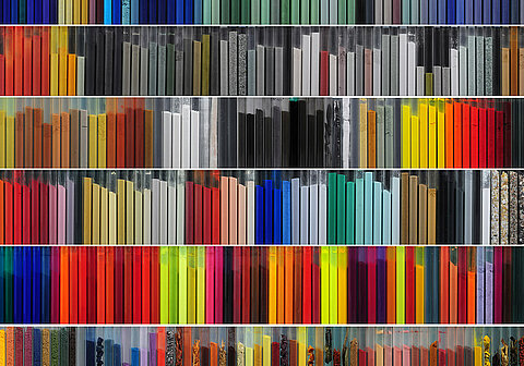
Realisation: Development of the Pro Architectura 3.0 tile system
Inspiration: The multisensory experience of colour
Task: Professorship of Methodology in Visual Communication, University of Wuppertal, Head of the Deutschen Farbezentrum e.V., Wuppertal

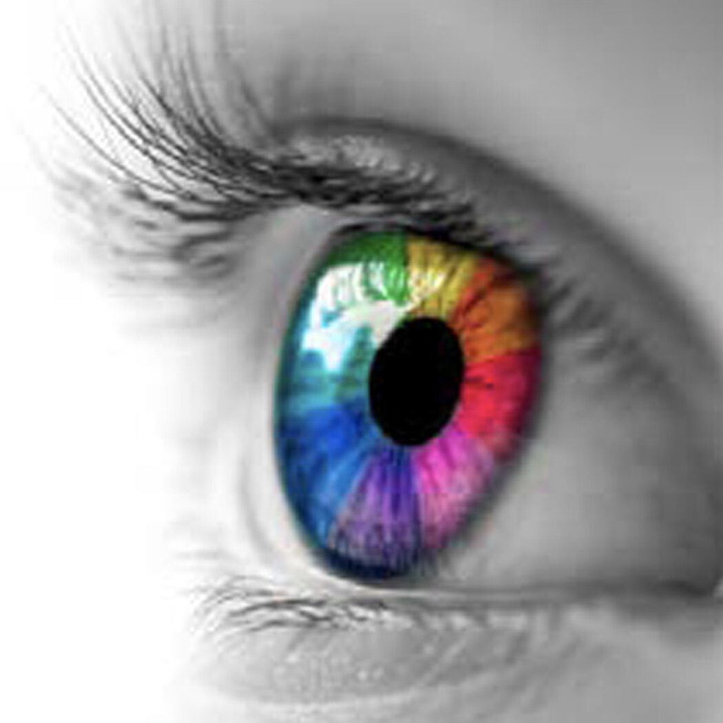
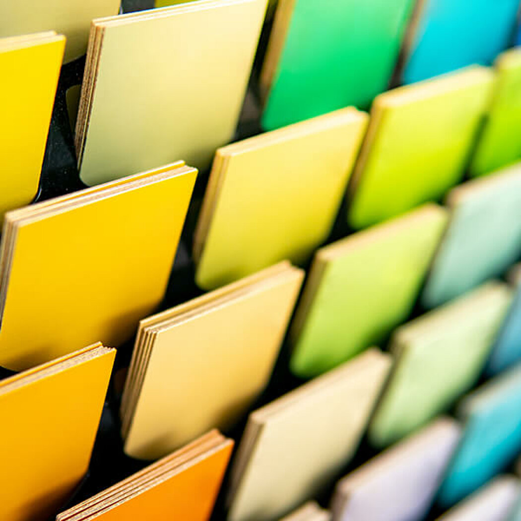
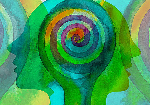
In summary, colour is nothing more than the refraction, absorption and reflection of light. What emerges is tremendous: we can perceive more than 20 million shades of colour. A conversation with colour researcher Prof. Dr. Axel Buether makes it clear how diverse colour influence is in everday life. TEST
Nature is capable of producing an immeasurable variety of colours. Can we even perceive this quantity in all its nuances?
We not only perceive them, we also process them as concrete information. For our brain, visual stimuli are among the most important carriers of information, 60% of which takes place through the perception of colours alone. However, 99% of this happens in the subconscious, and at an incredible speed. In a fraction of a second, we turn a perception into information when entering a room. A first impression that influences us positively or negatively. Colour is a kind of business card. In a stylish, classy ambience, colour is the first signal to make you feel comfortable.
Colour is therefore an indispensable part of communication - whether in architecture, design or fashion.
It is impossible to imagine design without it. You just have to realise that there is not a single object in the world that does not have colour. Colour is the number one medium of communication. Colour is the largest and, incidentally, the most understandable language in the world. Even if, culturally influenced, there are different interpretations, colour will always trigger the same associations. A blue like that of the sky is associated with sovereignity and trust all over the world. Red, on the other hand, has always been associated with the colour of fire. Therefore, it stands for danger, anger and aggression.


Do colours trigger certain reactions in us?
Our colour memory ensures that we do not only store colours as symbolic values. We also perceive colours physically. The sight of a gloomy grey autumn sky doesn't make us feel quite awake because serotonin production isn't in full swing. Fresh green, on the other hand, activates the hormonal balance. This is an important insight for every designer. With the help of colours, associations can be awakened that have a considerable influence on the feeling of well-being.
Does this mean that colours can influence all the senses?
Exactly. A light brown shade can create a haptic connection in the mind and remind you of a sandy, stoney beach. A strong turquoise can evoke a scent association with the fresh clear air by the sea. Colours also play a major role in terms of gustatory perception: the mere sight of a delicious dish sets metabolic processes in motion. The body prepares itself for the intake of food and can thus utilise it better. Our colour memory even establishes the connection between visual and gustatory memories: negative taste experiences, for example with spinach, can lead to a rejection of the associated strong green in all other areas. Studies have also shown that dishes coloured completely white, but still very wholesome and nutritious, led to considerable stomach discomfort in test subjects.
Can colour perception thus be described as a multisensory experience?
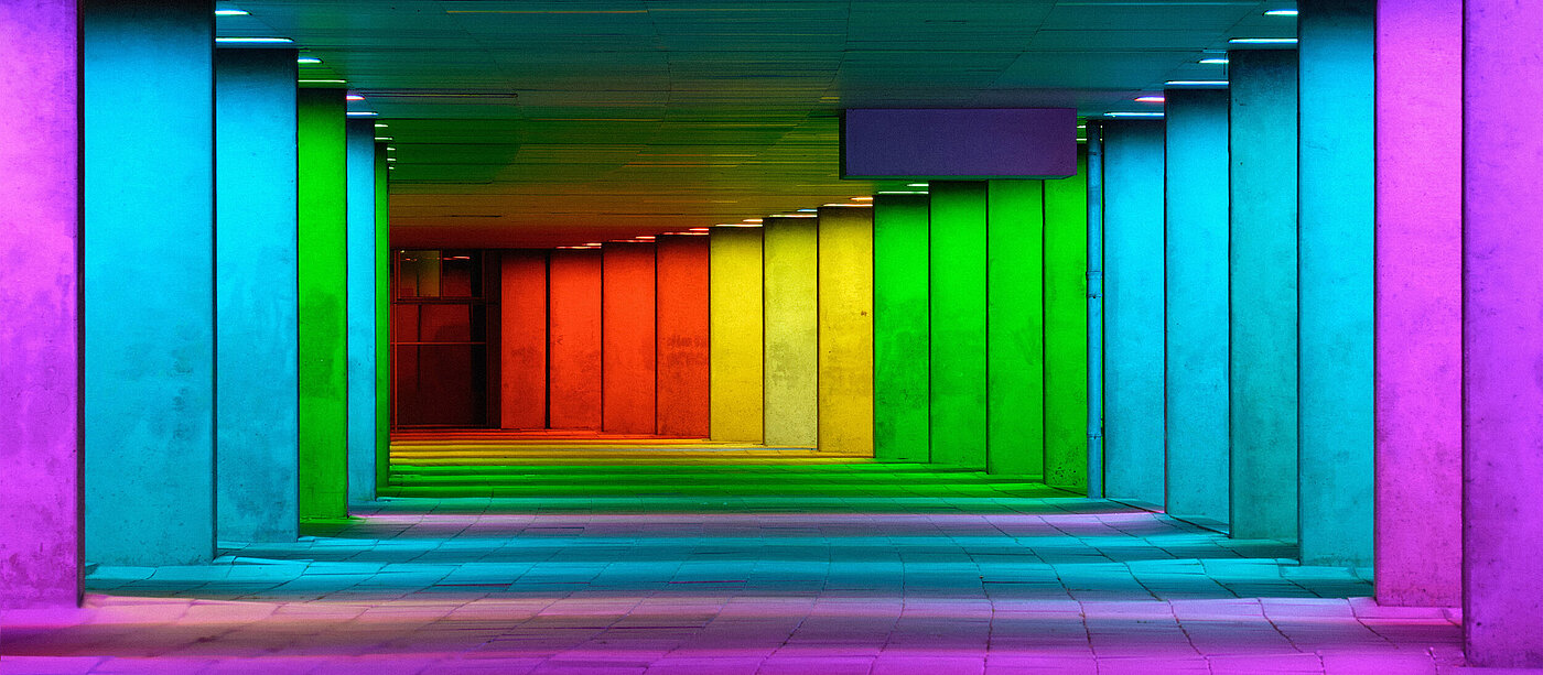
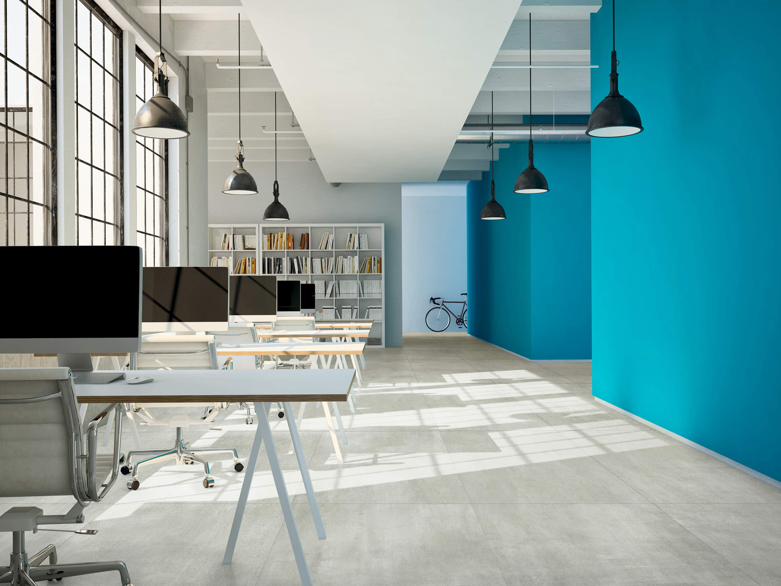
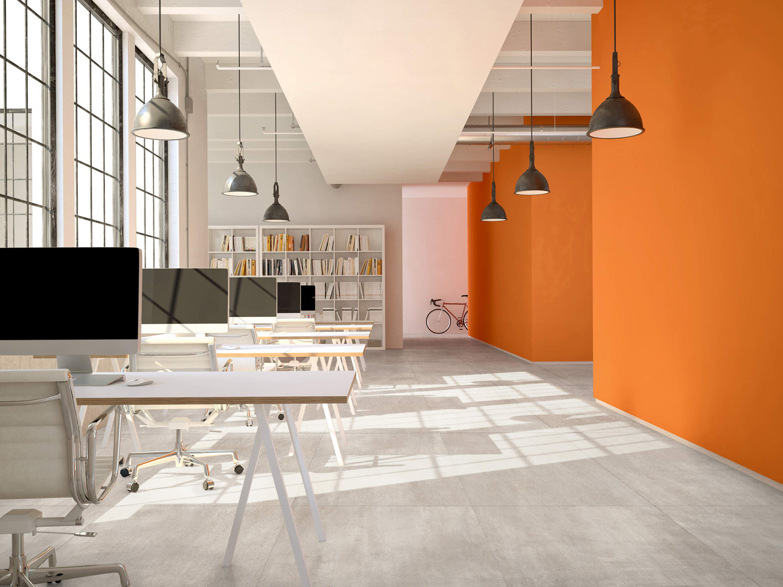
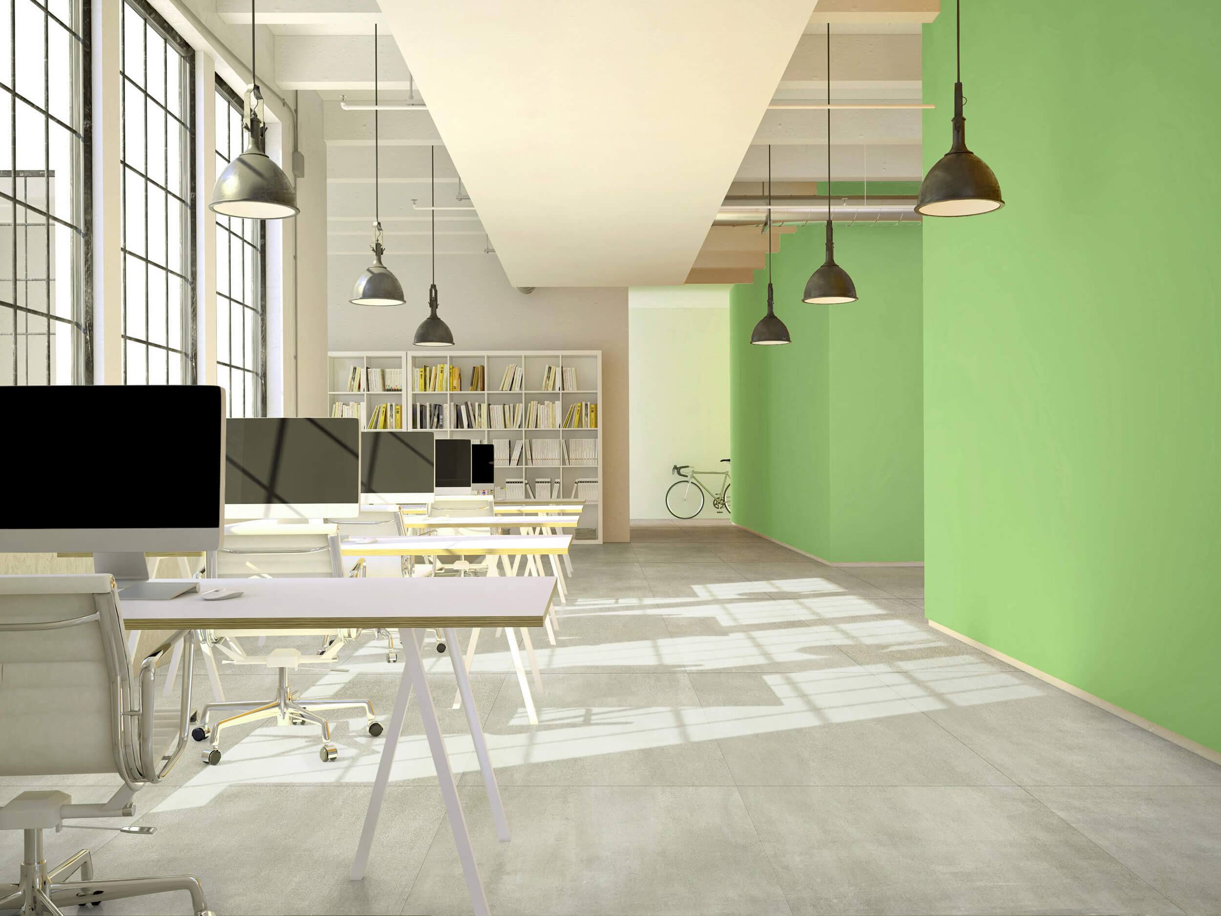
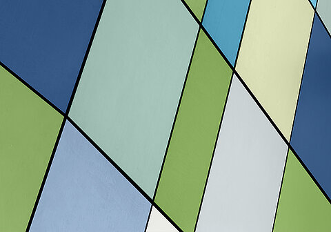
Colour can influence all the senses. And that is precisely what makes dealing with it so exciting for designers of all disciplines. The possibilities for playing with colours are virtually unlimited. Nevertheless, it is of course important to use them in a targeted way so that they achieve the desired effect. A good example of variability is the colour system of the Pro Architectura 3.0, where colours and formats complement each other wonderfully.
As Head of the Deutschen Farbenzentrum Wuppertal e.V., Prof. Dr. Axel Buether is committed to the knowledge of colour. The Central Institute for Colour in Science and Design is a non-profit, interdisciplinary and independent institution where designers, researchers, students and interested parties exchange ideas on the subject of colour.


